Amber Ayre
The Future of Technology in the Present
- Client
- Self
- Scope of Work
- Brand Identity
- Mobile UI Design
- Role
- Design | Illustration
Insight
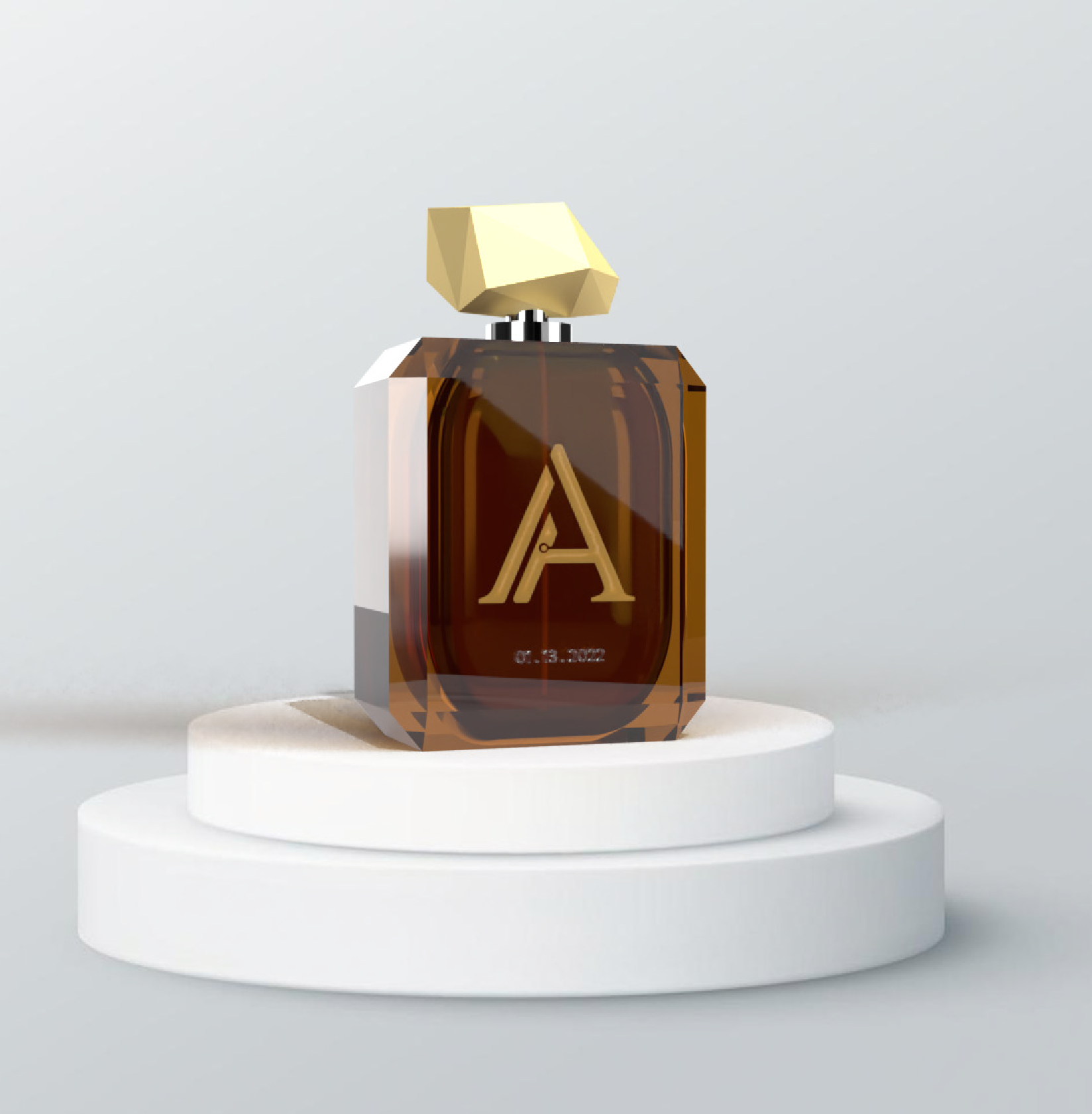
Amber Ayre creates personalized perfumes from odor perception data collected using our patented olfactotechnology. Our olfactotech patches attach to your temple and collects smell and emotional sensations related to an individual’s memories of a person or event. These data are then processed within our olfalimbic device. The output is an individualized scent that encapsulates and preserves precious memories.
Challenge
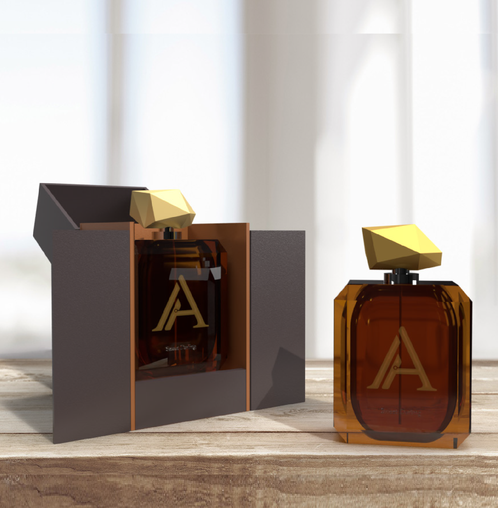
Working with a fictional company and completely having the freedom of creativity brought a lot of setbacks. The major challenge was designing the perfume products with having little to no experience in the perfume industry or product design. However, the objective I am trying to achieve is to create a product that encapsulates and preserves precious memories. of an individual.
Solution
To offically say that the project has been a success, the overall brand identity of Amber Ayre must show a sense of being Futuristic, Timeless, Exclusive, One-of-a-kind, Sleek, and Heart-Warming.
Brand Assets
What is the Brand?
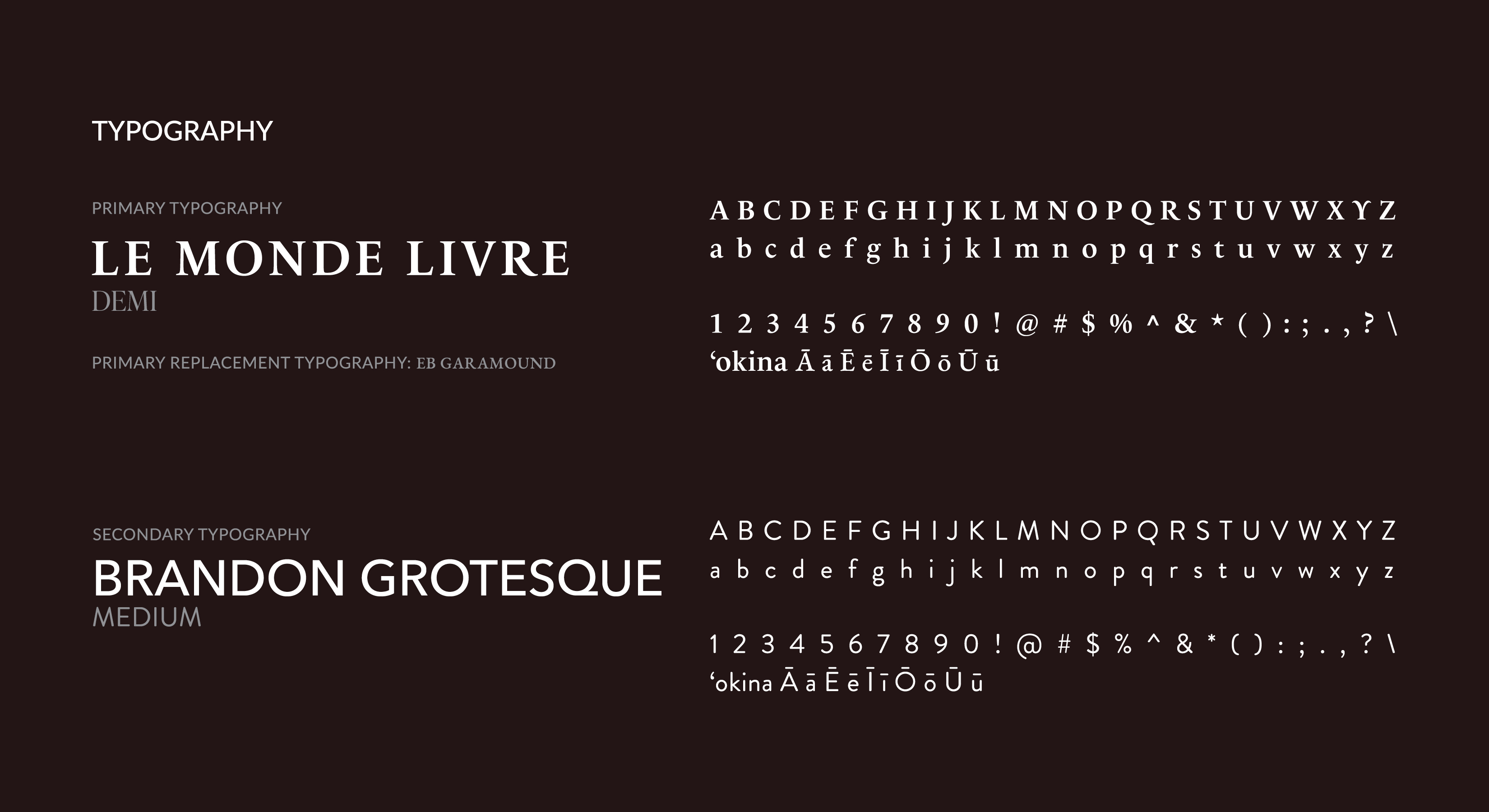
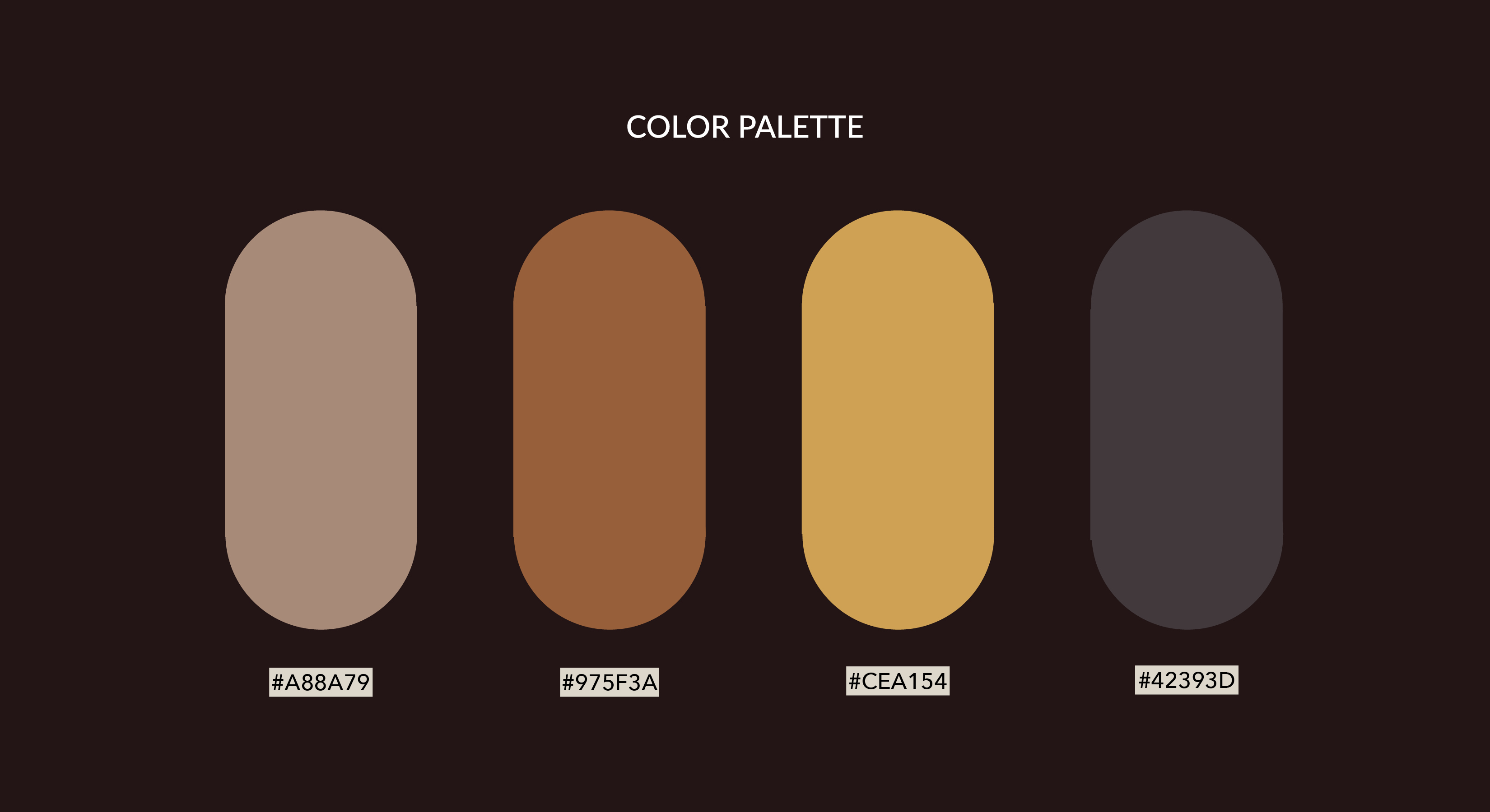
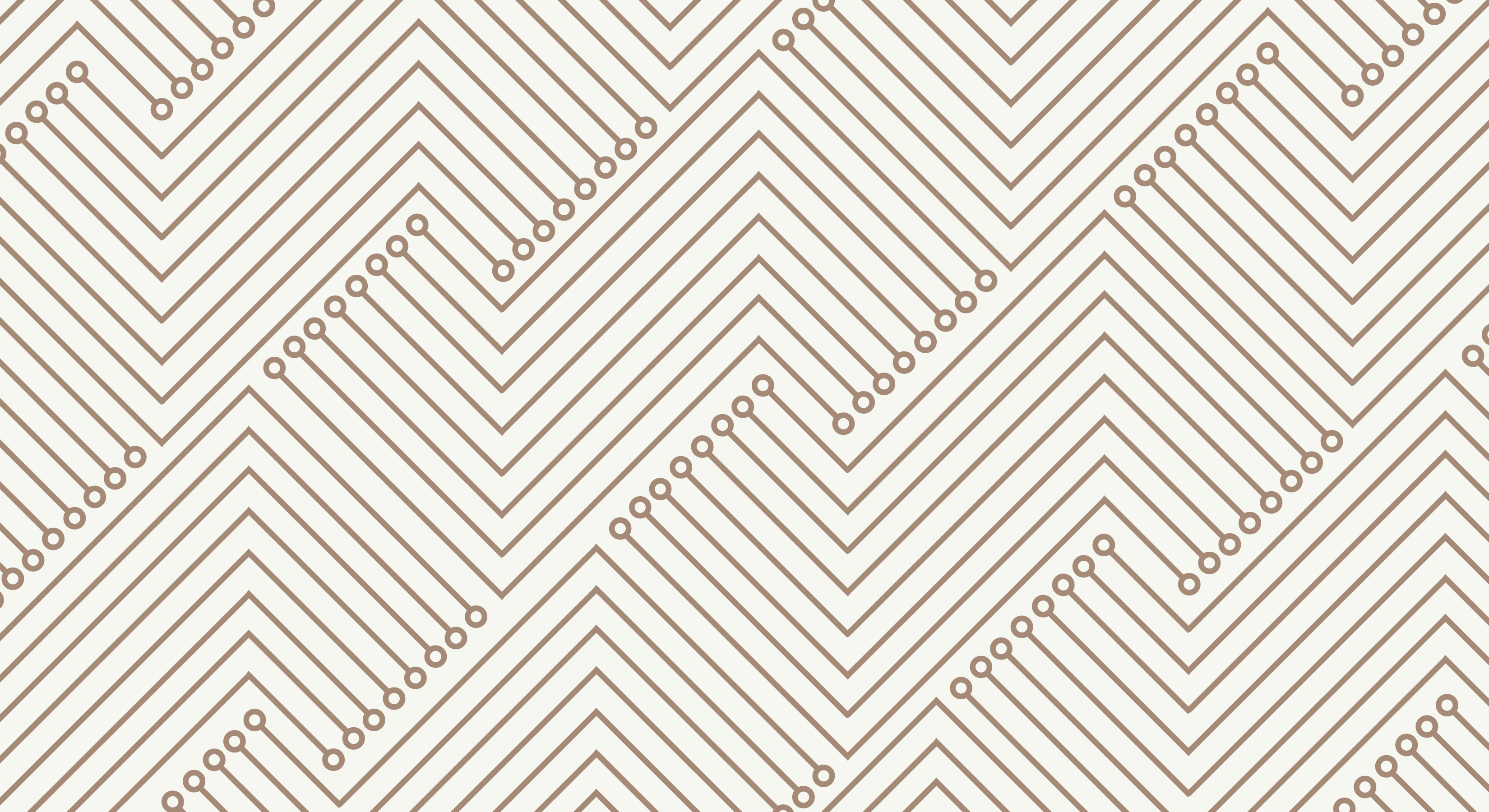
Knowing what your assets are (i.e., logo, color palette, typography, etc.) allows you to stay on brand, and consistent with any other deliverables you may have. The assets gives you the idea of how your overall brand will feel and look like.
Logo Process
Logo Variation
Some of the concepts I was going for were more of a type logo—taking the "A's" of the brand name while taking a futuristic approach to its design.
The second concept that I had in mind was implementing some sort of neurological/part of the body design with a tech side to it. In some cases, subtly portraying the usage of the brands product.
In addition, I would look at it from a different perspective, and looked at some of the negative spaces.
The Resolution
Amber Ayre is a very unique, and exclusive brand that is innovative. The logo is to represent those attributes, along with embodying a timeless, humble look and feel. A simplistic ‘A’ logomark taken from the type itself creates consistency with its logotype—negative and positive spaces can create a different approach to a design. The word ‘Amber’ has its meaning, and correlates with the colors used. Both amber and Amber Ayre preserve a piece of history—a moment in time. To capture that correlation without interfering with the logo, the warm amber color of a yellow-orange is what brings it all together.
Design Process
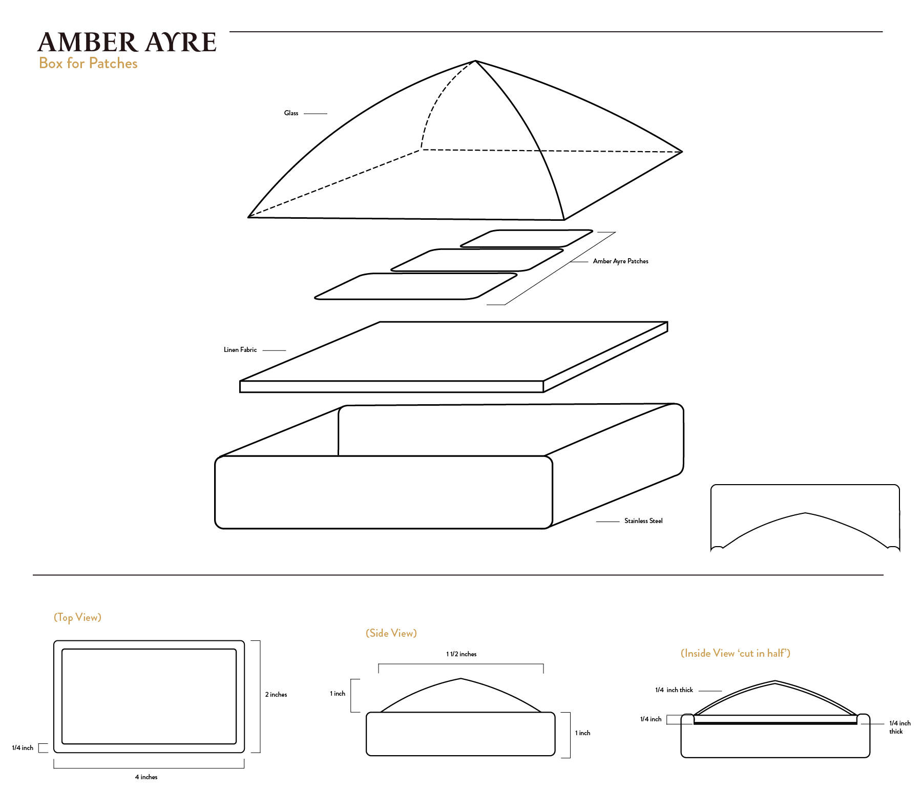
Schematic Process
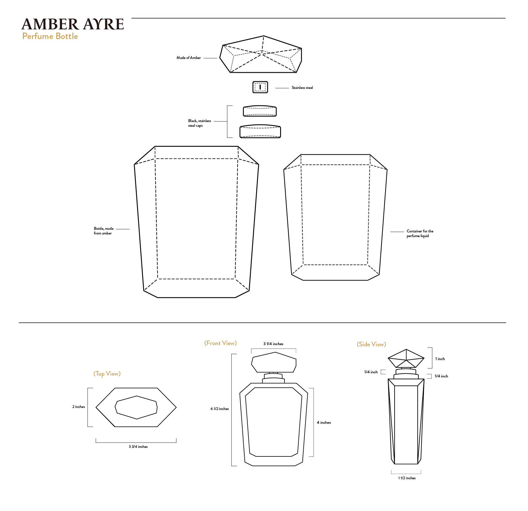
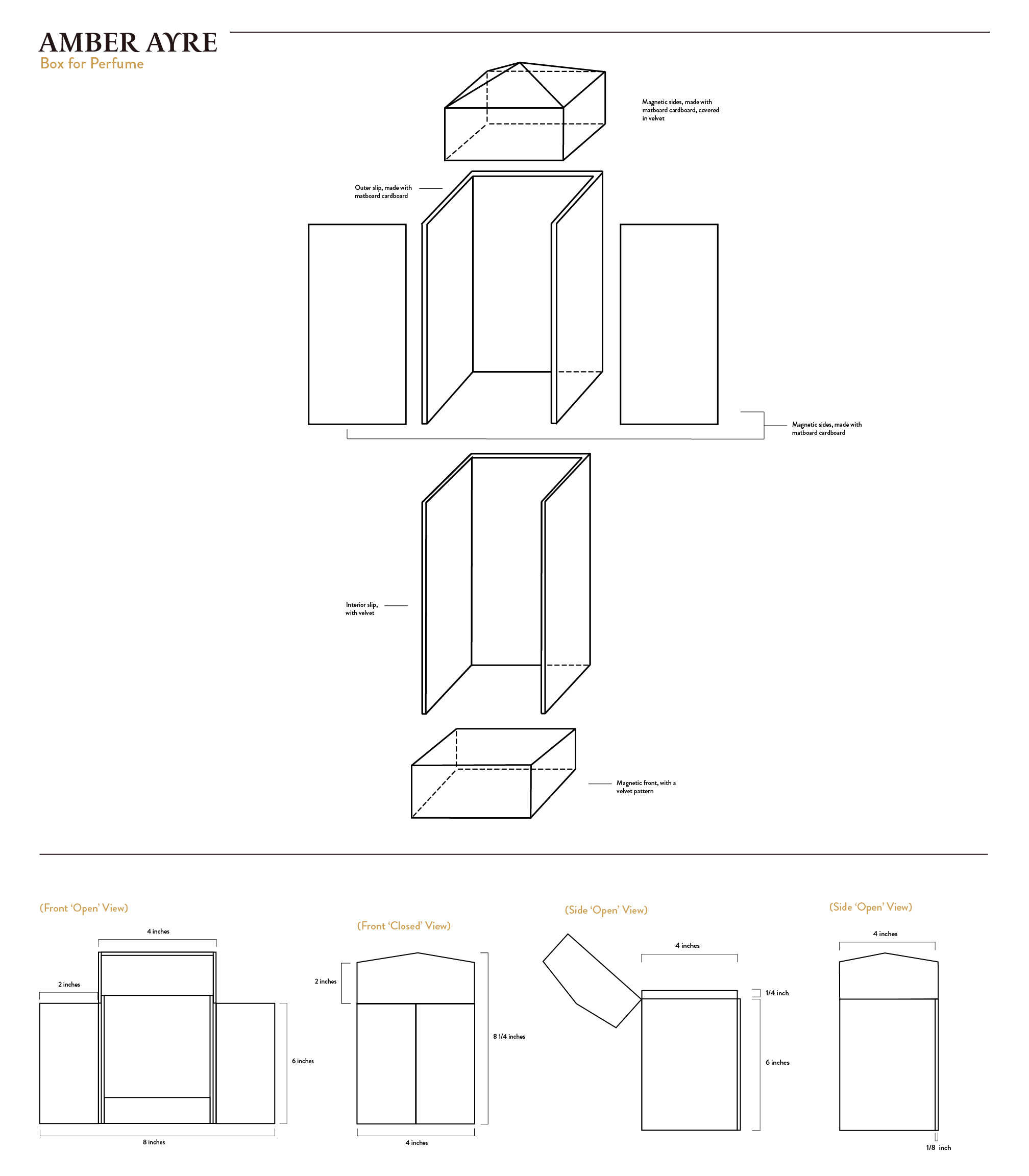
The challenge with the schematic drawings was making sure the measurements all line-up with each other. Assuring that what I am designing will fit into it's appropriate spots.
Mobile App Design
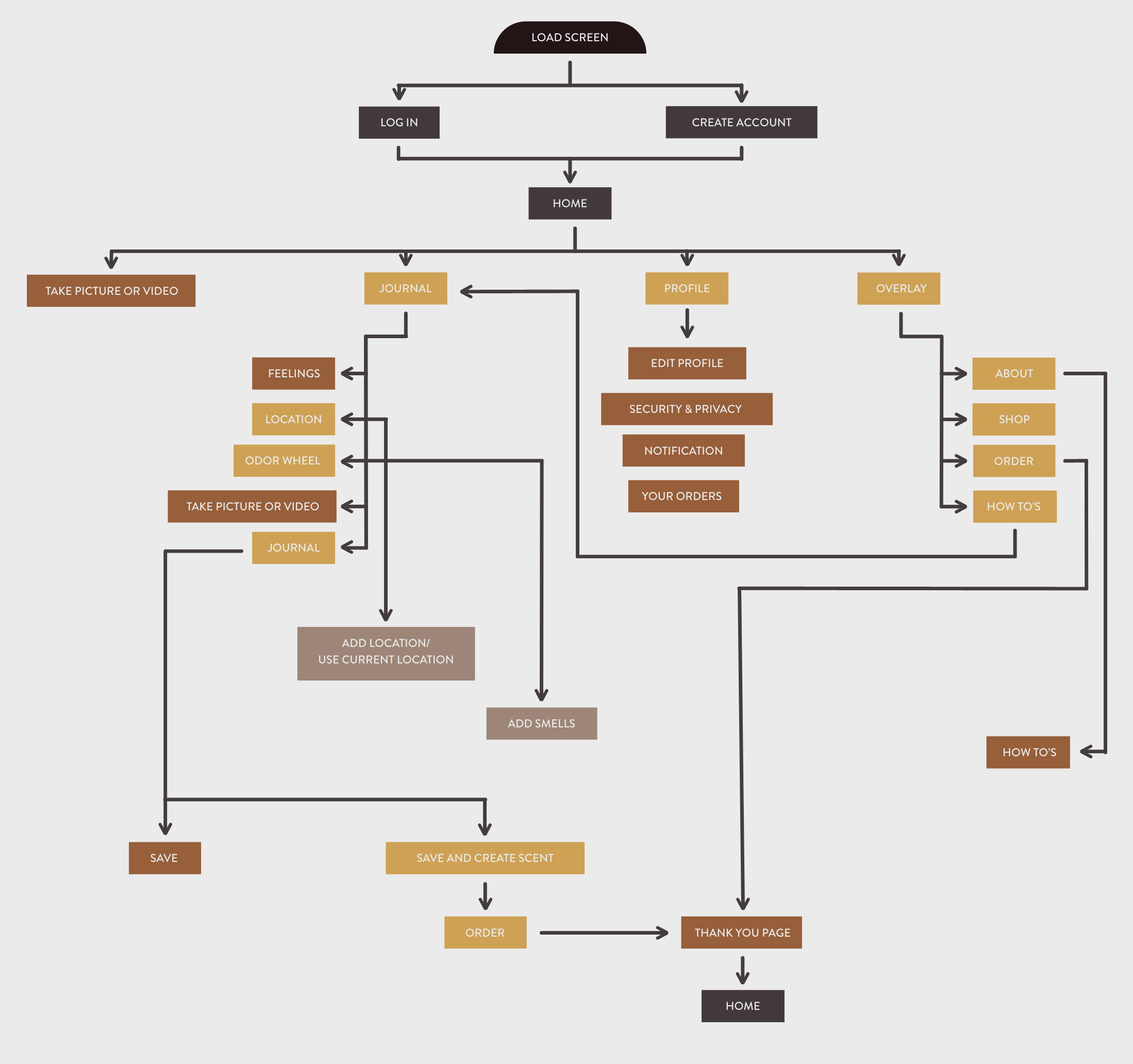
User Flow Chart
Building a lo-fi wireframe gives you the foundation of your website. It is the first idea for your mobile app, and it does not need to look “the best” at this stage, but it would be best to have some context in there.
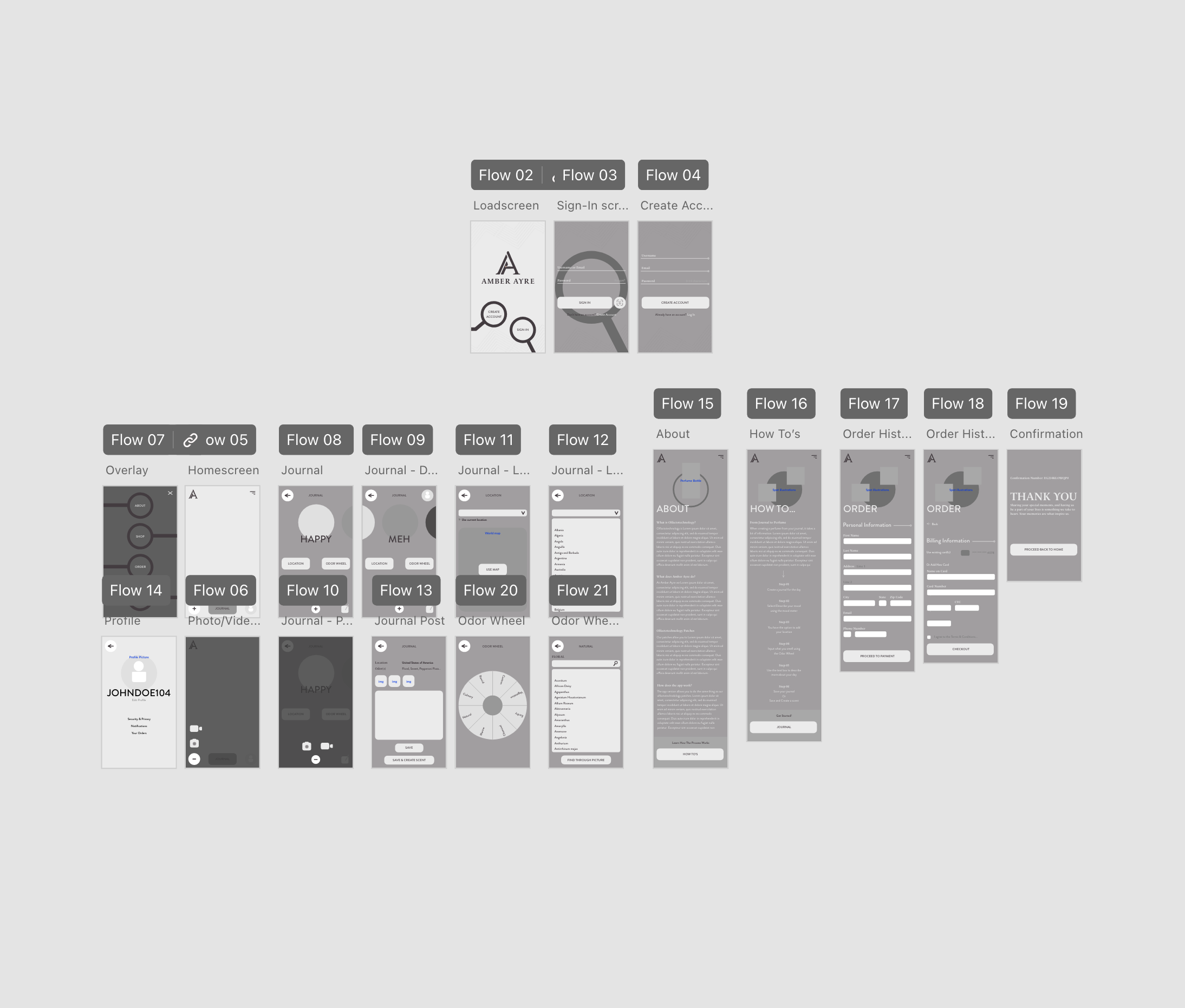
Lo-Fi Wireframes
Building a lo-fi wireframe gives you the foundation of your website. It is the first idea for your mobile app, and it does not need to look “the best” at this stage, but it would be best to have some context.
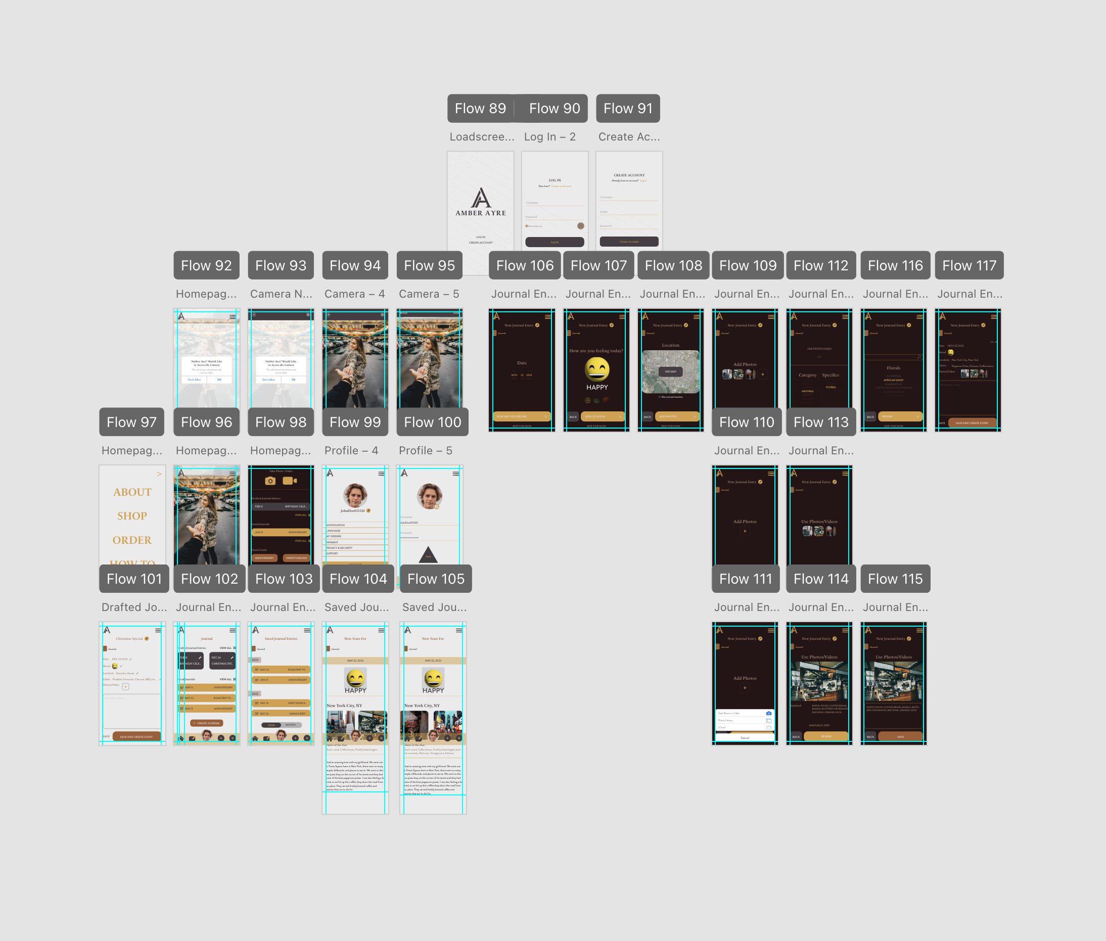
Hi-Fi Wireframes
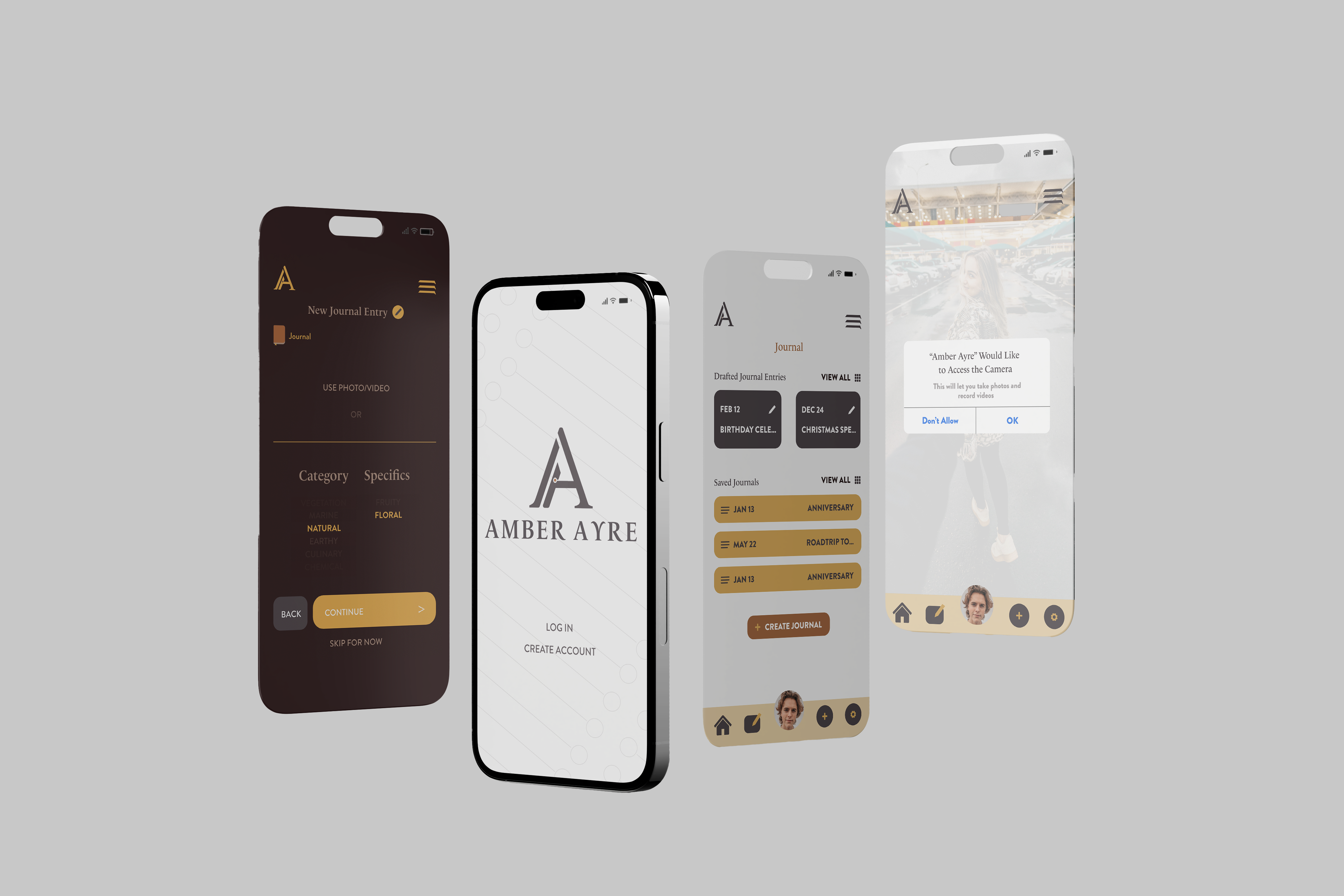
Hi-Fi wireframes give you the opportunity to take what you had for your Lo-Fi wireframes and add images, your logo, buttons, etc. You have free range as to what you can do with your mobile app design. It was recommended to accomplish 2 different designs, then taking one or both ideas to fine create a third design.
.png)
.jpg)
.jpg)
.jpg)
